

Choosing the perfect paint color for your home can seem like an impossible task. Whether you’re revamping a single room, or remodeling your new home, the color of a room can set the tone of an entire space. Perhaps a little science and human psychology can help make your paint dilemma a little easier!
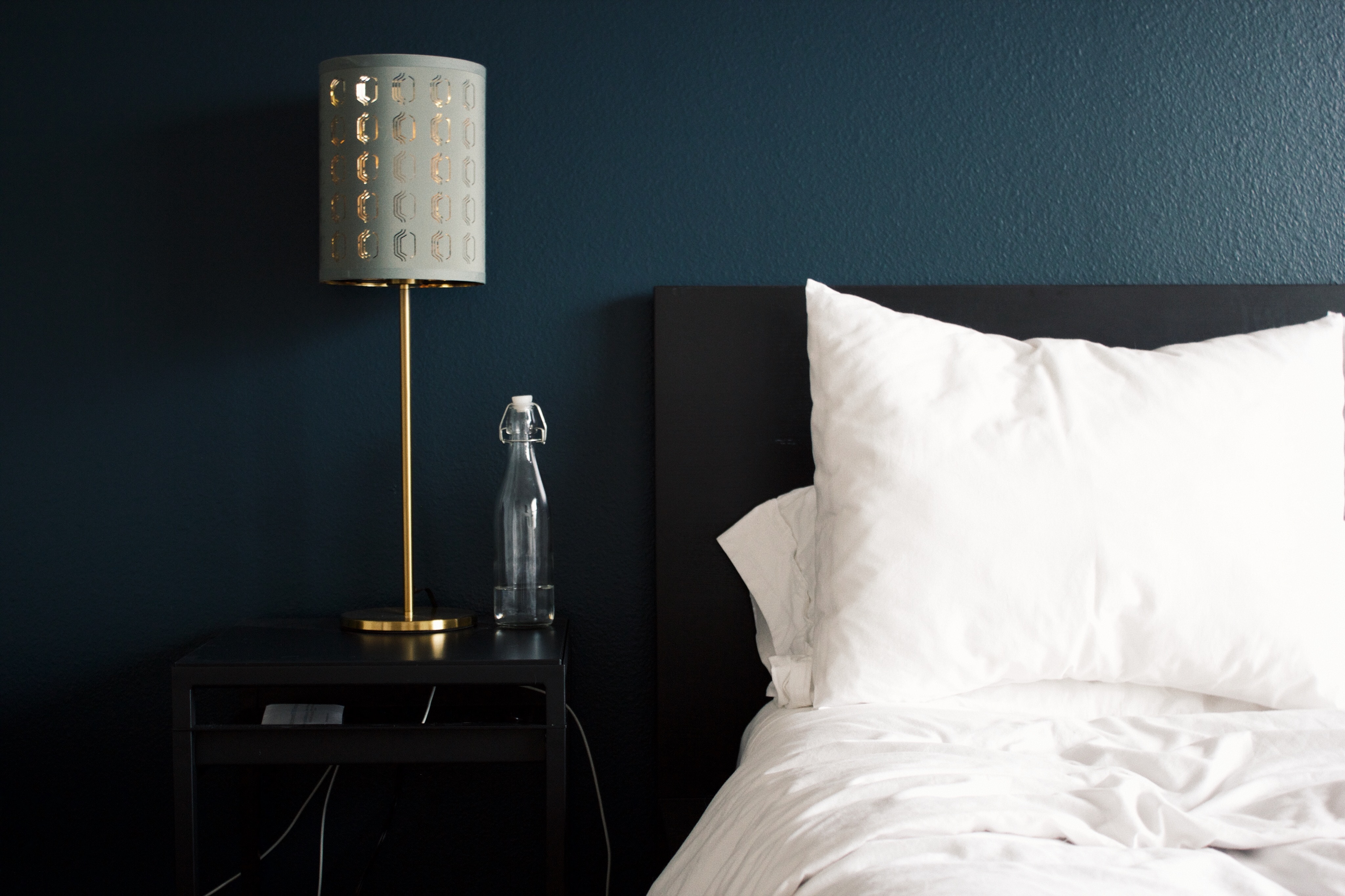
Bedroom
Recommended Color: Blue
People often associate the blue with calm and rest. Dusty blue or other shades that are low in saturation and high in brightness will maximize the room’s affect and create a relaxing sleep environment.
Colors to Avoid: Purple
While blue and purple are similar colors, purple can stimulate the mind making it difficult to fall asleep. Studies have also shown the color purple has the ability to boost nightmares.
Home Office
Recommended Color: Light Green
Green encourages a clear mind and is often associated with relaxation and nature. Less-saturated shades like sage and sea green are ideal.

Colors to Avoid: Red
Studies have shown that exposure to the color red can lead to distraction, worry and reduce a person’s ability to focus on mental tasks.
Kitchen
Recommended Colors: Warmer tones or cobalt blue
Warmer, more saturated tones like red and orange are frequently used in fast-food logos and are believed to encourage hunger. Colors like blue and purple have been deemed “unappetizing” and may aid in suppressing appetite.
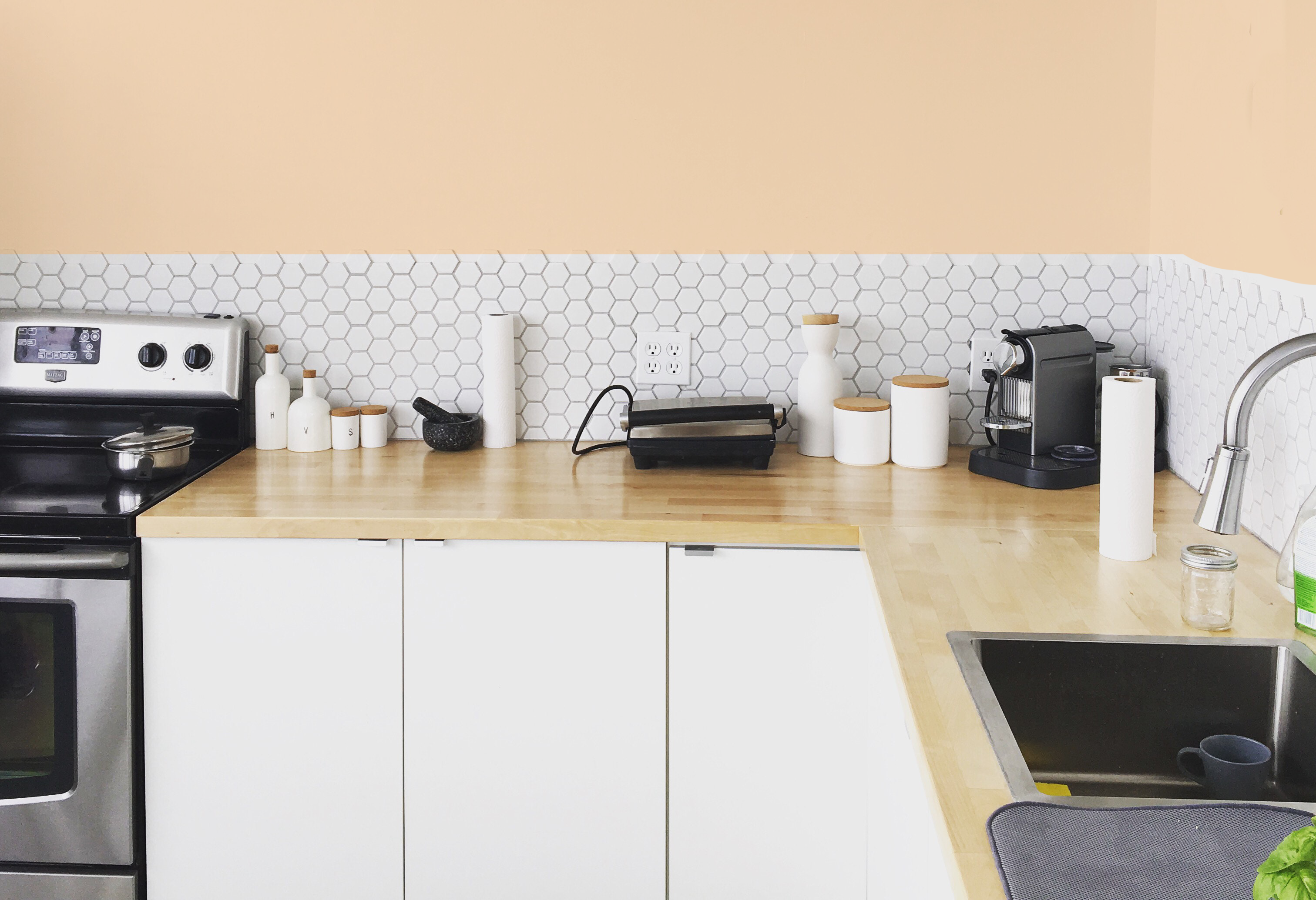
Colors to Avoid: Greenish Yellow
The color yellow is a relatively common kitchen color, but if a slight hint of green is added to the shade it may be reminiscent of illness.
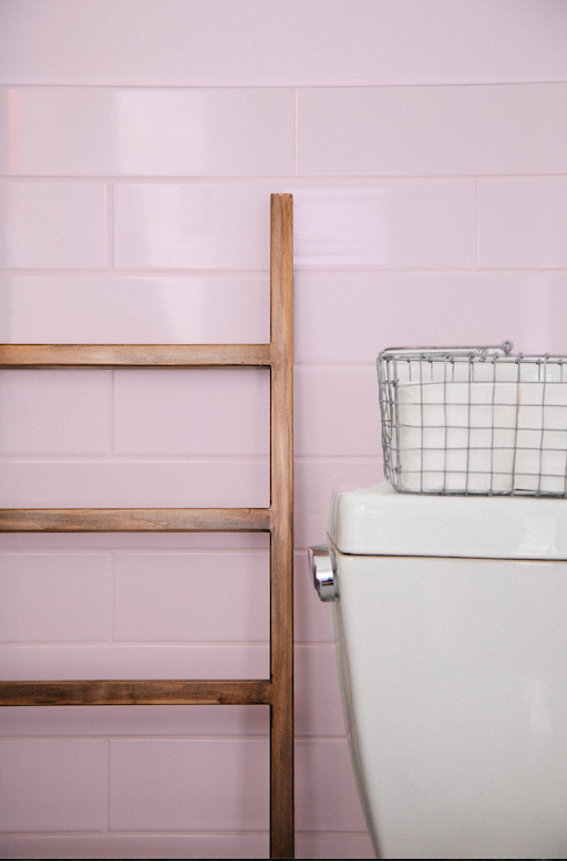
Bathroom or Vanity
Recommended Color: Light Pink
While the color white is often used in bathrooms for its representation of cleanliness and purity, it can sometimes make a room feel plain if it is paired with understated fixtures and accessories. A light shade of pink is a suitable alternative that is simple, subtle, and refreshing.
Colors to Avoid: Neon
Neon colors in a confined space may cause discomfort and inspire feelings of claustrophobia.
Living Room
Recommended Color: Warm Sand
The living room can be a social space or a quiet area for relaxation. Choosing to err on the side of tranquil, neutral tones allows for a more versatile space that complements both relaxed and upbeat social gatherings.

Colors to Avoid: Anything Too Dark or Saturated
Although bold colors can add a hint of drama or “pop” to a living room, sometimes less is more as too many deep tones can feel harsh.
To read the full article, published by PureWow, click here.